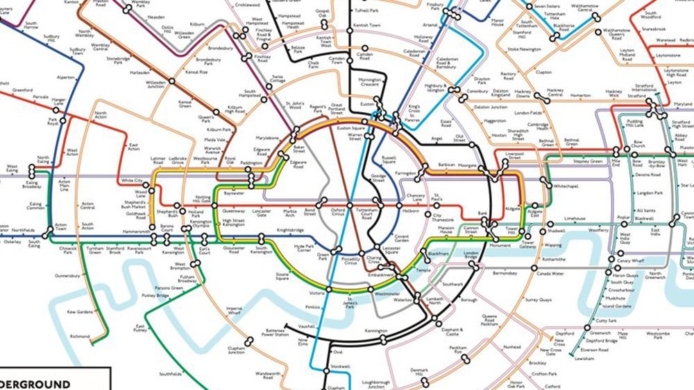
A redesigned London Underground map, reimagined in a circular format by cartographer Max Roberts, is gaining renewed attention online. This updated version of Roberts’ design, which initially went viral several years ago, aims to offer a less cluttered and more geographically accurate representation of the Tube network compared to the iconic official map, originally designed by Harry Beck in 1933.
Roberts’ circular map arranges the traditional coloured Tube lines as spokes radiating from the centre, aiming for improved readability and geographical precision. While not the first to explore a circular Tube map – Roberts cites Jonny Fisher’s 2013 design as initial inspiration – and following Transport for London’s recent use of circular maps in a Samsung promotional campaign on the Circle Line, Roberts refined his 2013 version, correcting errors using older software.
According to Roberts, the resemblance of the Circle Line to the Tube logo in his design is coincidental, arising naturally from the line’s actual shape. While a departure from the established map, Roberts draws parallels to the initial reception of Harry Beck’s revolutionary design in the 1930s. Posters of Max Roberts’ map designs are available for purchase online.
Leave a Reply